Work / TANDA
Tanda
Brand strategy · Business planning · Campaign + art direction
Speculative portfolio concept · not a live financial product
Objective
Many financial experiences are built around technical vocabulary and one “default” customer. For TANDA, an imagined bilingual fintech, the goal was a brand campaign that makes everyday banking feel understandable, reassuring and culturally expressive, without giving up clarity or safety.
Process
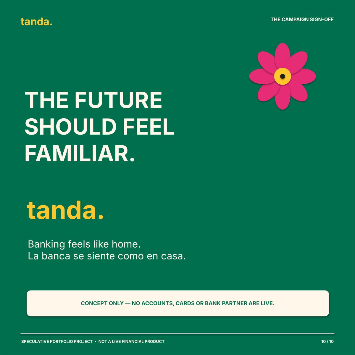
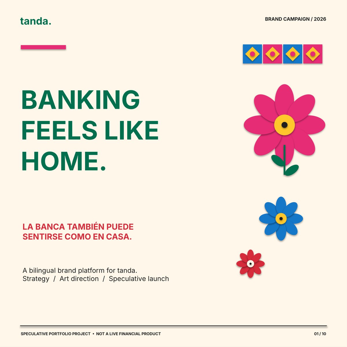
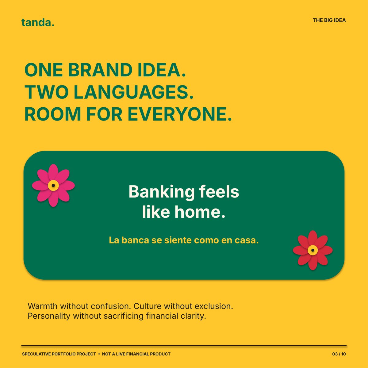
I mapped four audiences, from Spanish-first older adults to students and multigenerational households, then built one platform in two languages: “Banking Feels Like Home / La banca se siente como en casa.” Three message pillars, Mexican folk-art-inspired art direction, three mock ads, a channel plan and a measurement framework.
Result
A 10-slide LinkedIn carousel, three mock ads, a bilingual messaging framework and a rollout and KPI plan, backed by a business plan, financial model, competitive analysis, pitch deck and brand guidelines. Because it’s a concept, there are no campaign results; instead I defined how the work would be tested and what has to be proven before launch.
Brand strategy · Business planning · Financial modeling · Competitive analysis · Art direction · Bilingual messaging · October 2026
Read the case study (PDF) ↗︎See the carousel (PDF) ↗︎
The insight
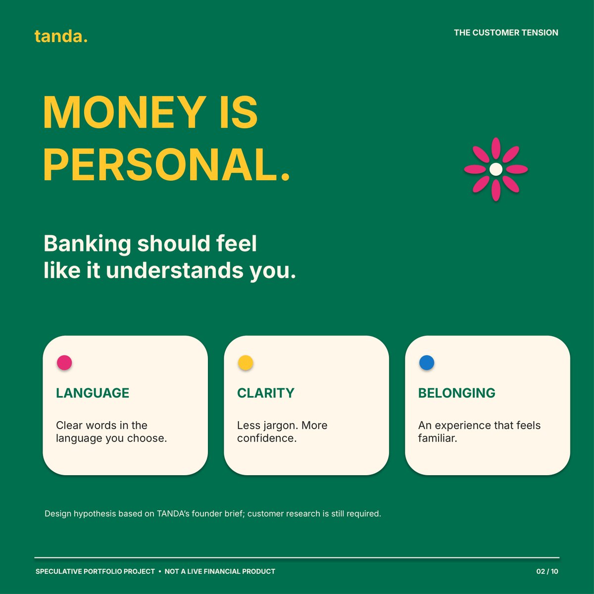
Money is personal, and banking should feel like it understands you: clear words in the language you choose, less jargon, and an experience that feels familiar. I treated this as a hypothesis to test with real customers, not a proven finding.
Two languages, one voice
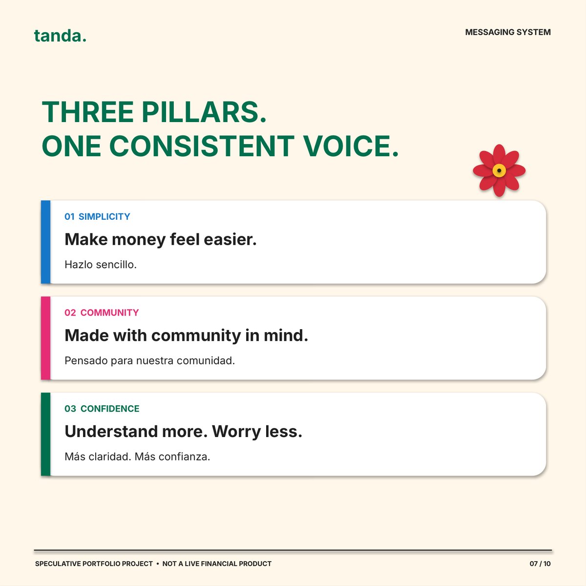
English and Spanish written from the start, not translated after. Three pillars carry every message: Simplicity (“Make money feel easier / Hazlo sencillo”), Community, and Confidence (“Understand more. Worry less / Más claridad. Más confianza”), matched in meaning rather than word for word.

Three mock ads
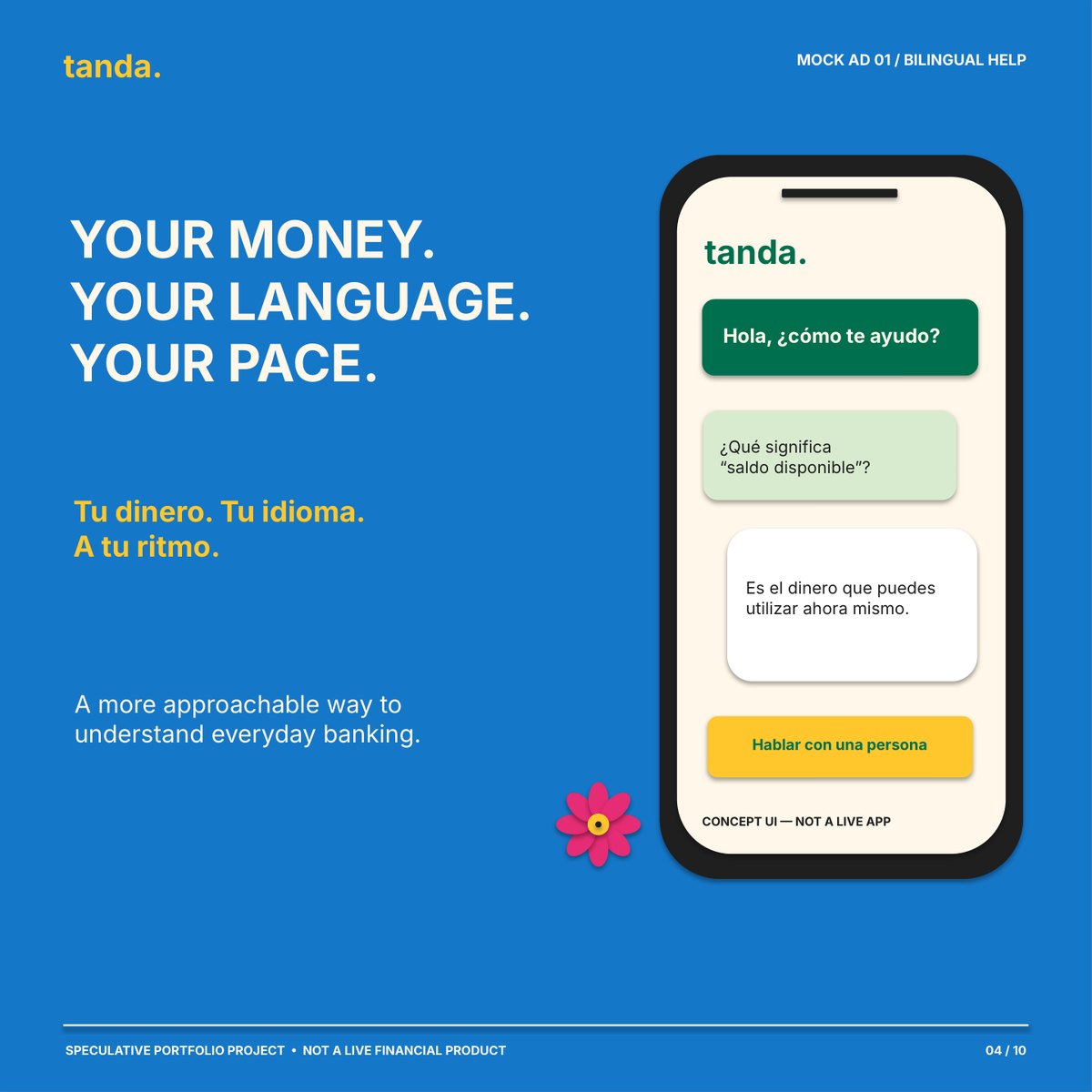
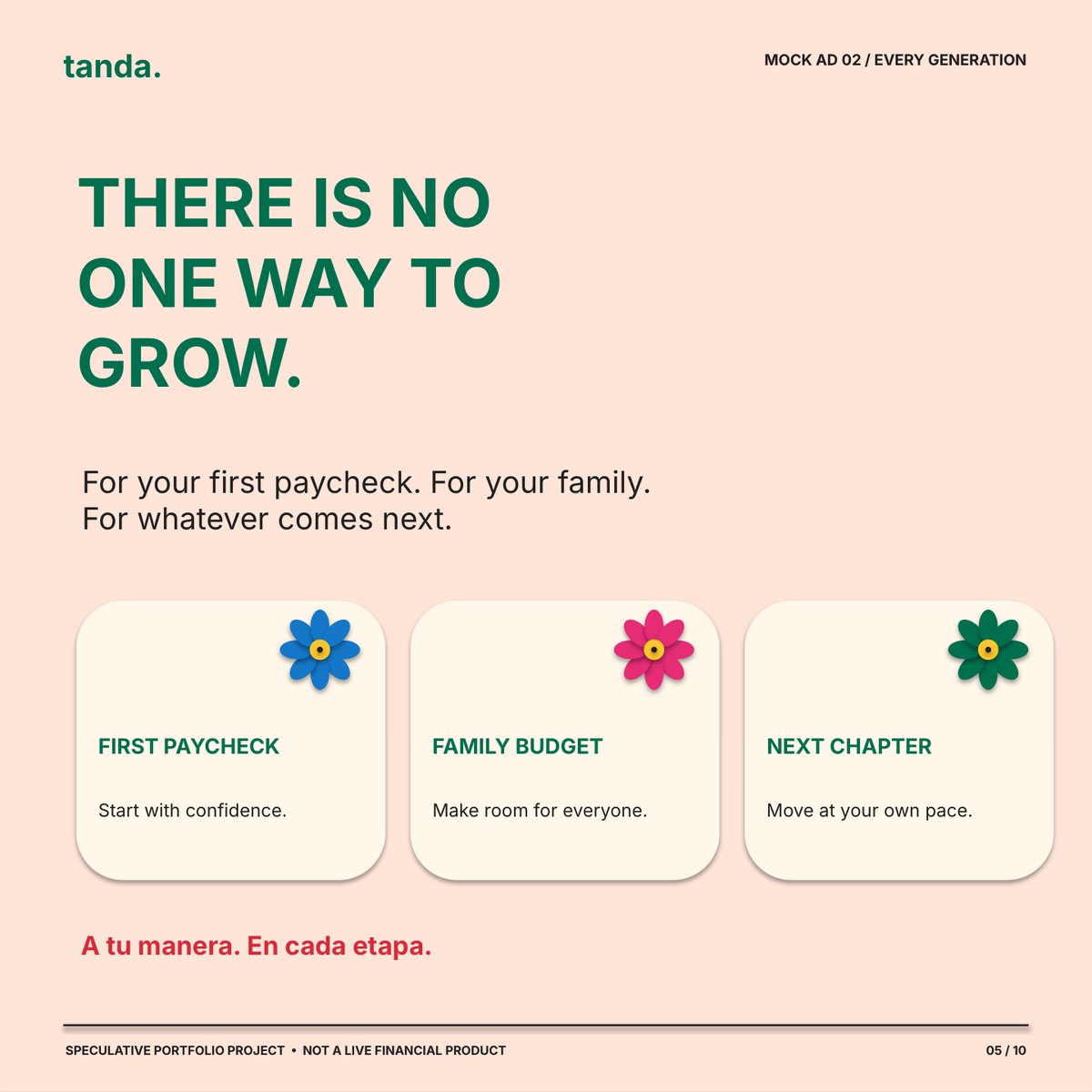
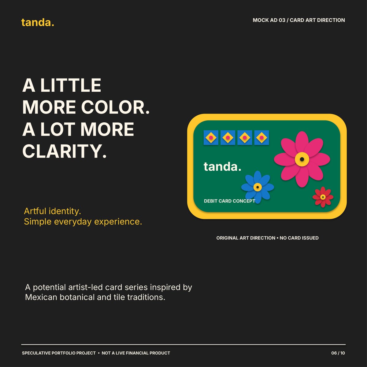
Bilingual help (“Your money. Your language. Your pace.”), every generation (“There is no one way to grow.”), and an artist-led card concept inspired by Mexican botanical and tile traditions (“A little more color. A lot more clarity.”). Every screen and card is labeled as a concept.
Channels + measurement
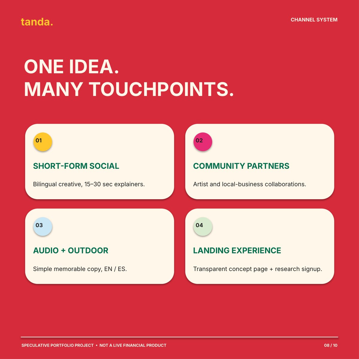
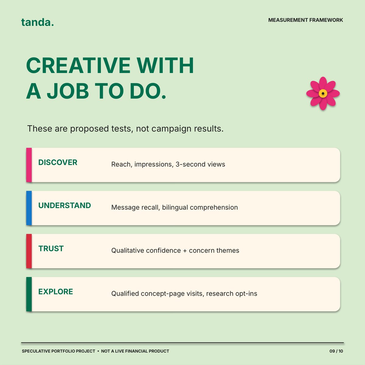
One idea across short-form social, community and artist partnerships, audio and outdoor, and a transparent concept page. Each channel has a hypothesis to test, and every metric has a decision rule: Discover, Understand, Trust, Explore.
The business case
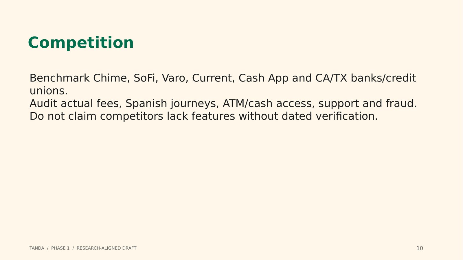
Behind the campaign, I planned the company: a business plan for a bilingual nonbank fintech launching in California and Texas, a competitive benchmark against Chime, SoFi, Varo, Current, Cash App and the big banks, a 15-slide pitch deck and brand guidelines.
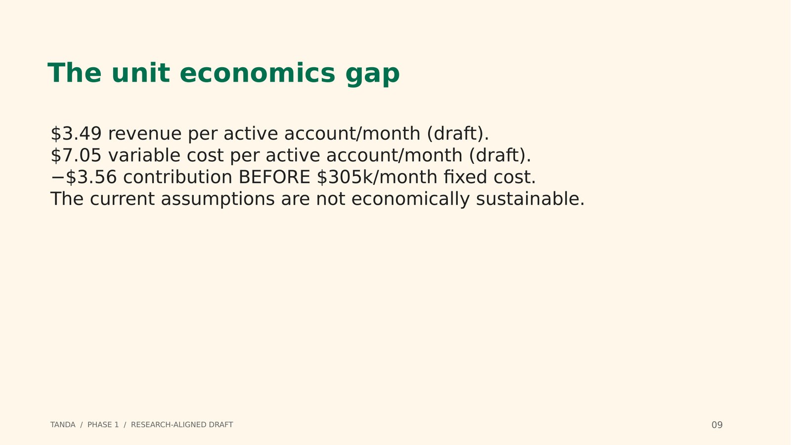
The financial model is honest about the gap. Draft numbers show $3.49 in revenue against $7.05 in variable cost per active account each month, so the plan spells out what has to be proven, like interchange, deposit economics, fraud and support costs, instead of inventing traction or a raise size.
The documents
A speculative concept, not a live financial product.
- Campaign case studyPDF · 4 pages
- LinkedIn carouselPDF · 10 slides
Marketing it responsibly
Financial brands need restraint. The campaign never invites anyone to open an account, never claims FDIC coverage or “no fees,” and never implies older adults can’t handle money. The hard part was balancing an exuberant, Mexican-inspired look with the calm that financial trust requires.